LockBox — AI-enabled FinOps tool
The operations team at a U.S. healthcare fintech was processing every incoming document by hand. Transfer forms, checks, repayment requests. Each one reviewed manually, matched to a member, applied to their account. I designed LockBox to change that.
AI Tooling, Internal Ops

Lockbox is an internal platform where AI reads incoming financial documents and suggests matches, while operators verify and make the final call. I was the sole designer, working from business requirements through to final UI, testing, and edge case coverage.
The company administers Health Savings Accounts for employers and employees across the United States. HSAs are heavily regulated. Funds can't just be moved around freely. Every transaction needs to be coded properly or members end up with tax problems.
A small FinOps team of 5-15 people handled all of this. Before Lockbox, the entire process was manual: open a scanned document, find the member in the system, apply the transaction. The engineering team had started using AI to extract data from scans, but there was no interface around it. That's where this project started.
Key contributions
Worked through regulatory logic before opening Figma
Four document types, each with distinct rules. I spent the first phase mapping decision trees with product management. What happens when a check can't be matched to a claim? When can a repayment be partially denied? These questions shaped the interface far more than any layout decision.
Defined a shared layout that works across all four workflows
Every workflow follows the same structure: scanned document on the left, AI-extracted data and suggestions on the right. I didn't start there. It emerged after designing flows for each type individually and seeing the same pattern repeat.
Tested with the people who'd use it every day
I ran through complete flows with FinOps specialists. Their feedback changed real things. How the interface handles a check that matches no claim. What the operator sees when a form is incomplete. How to split a repayment across three claims without losing track of the math.
Built reusable components across workflows
Document preview, suggestion cards, decision actions, audit trails. Once the shared patterns became clear, I worked with engineering to build them as components. When the business adds a new document type, the foundation is already there.
One layout for four workflows
The big design question early on: do we build four separate tools, or find a pattern that holds across all of them? The FinOps team is small. They process all document types in the same shift, sometimes back to back. Switching between different interfaces would slow them down.
I started by designing each workflow individually. Inbound transfers were first since the requirements were clearest. By the time I got to outbound transfers, I noticed I was making the same layout decisions again. Document on the left, structured data on the right, suggestions below, actions at the bottom.
So I pulled back and formalized it. One layout, four configurations. The document types differ in what data gets extracted, what AI suggests, and what actions are available. But the operator always knows where to look.

Inbound Transfer of Assets. The check is scanned on the left. On the right: AI-extracted fields and a suggested employee match with an "All Data Matched" confirmation.
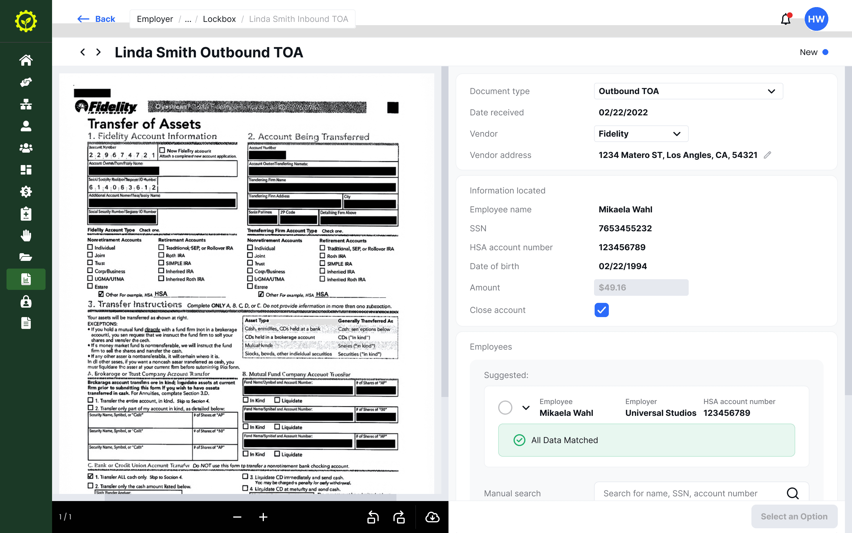
Outbound Transfer. A denser document but the same layout. The operator doesn't need to relearn anything between document types.
Designing around AI confidence
The AI reads each document and proposes a match: this check belongs to this member, this repayment is for this claim. When it's confident, a green "All Data Matched" badge appears. When something doesn't line up, a yellow warning flags the mismatch.
The important design decision was to always show the AI's work, not just its conclusion. Every extracted field is visible: employee name, SSN, account number, amount. The operator can check each one against the scanned document right next to it. Manual search is always available as a fallback.
I initially considered hiding the detail when confidence was high. Just show the match, let the operator approve. But in testing, the team told me they wanted to see the data regardless. These are regulated accounts. They need to know why the system matched, not just that it did. That feedback changed the design.

Claim repayments are the hardest case. Two possible claims with different match confidence. The operator allocates funds and can search for additional claims manually.
Handling the unhappy path
The happy path is fast. AI matches correctly, operator confirms, next record. Most of my design time went into everything else.
Declining a transfer isn't just clicking "decline." The operator has to select a reason: participant can't be found, account closed, insufficient funds. Each reason can trigger different downstream actions. There's a note field for anything that doesn't fit, and everything gets logged for compliance.
Claim repayments pushed this further. A single check might need to be split across multiple claims. The amount might not add up. The operator might need to partially approve: apply some of it, return the rest. Every combination needed its own interface state, clear enough that someone processing dozens of these a day wouldn't make a mistake.
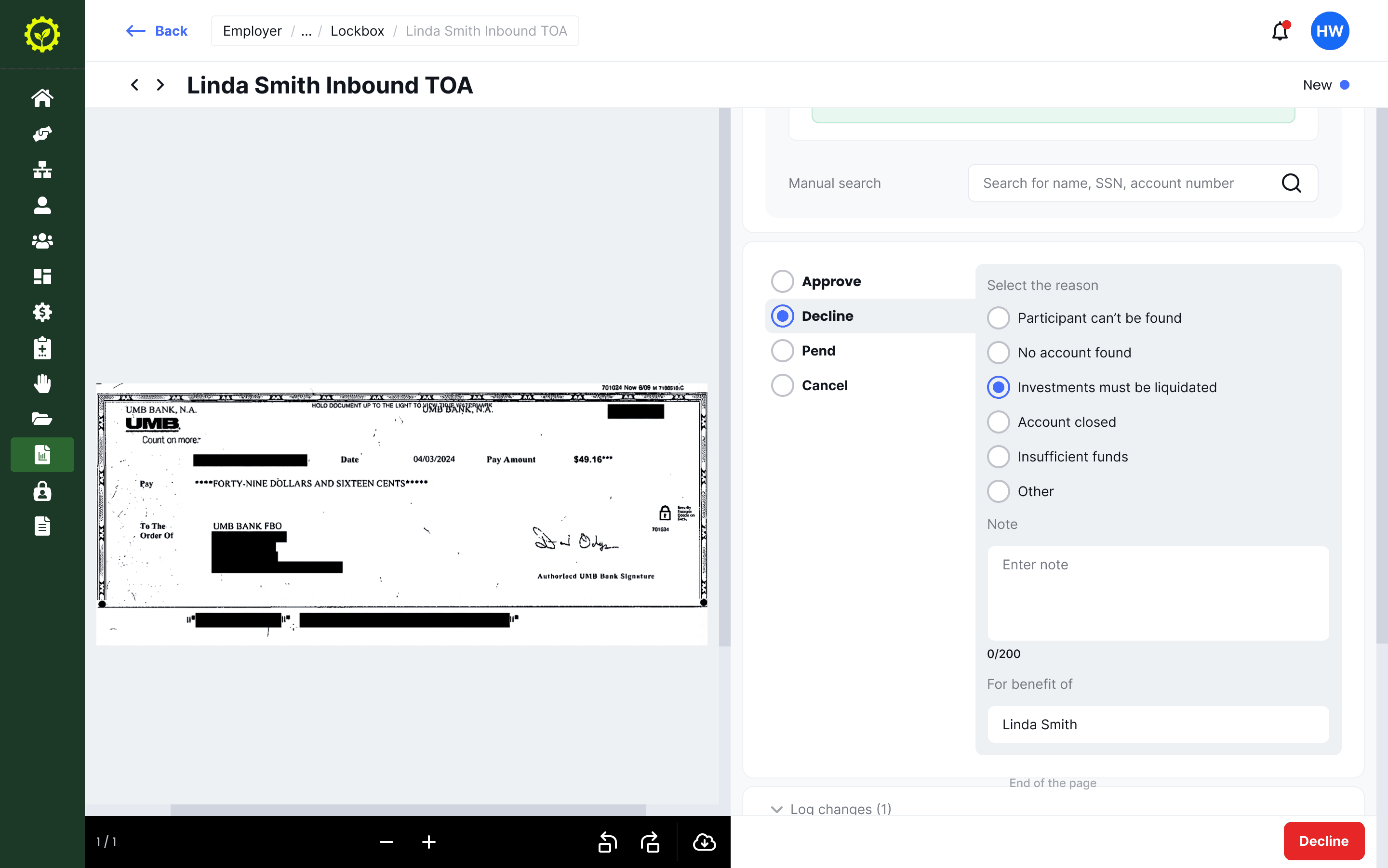
Declining requires a specific reason. The note field and structured reasons keep the audit trail useful for compliance review.

Returned checks show the full history of the original check. After processing, the operator's action is logged with name and timestamp.
Outcome
From manual data entry to verification and exception handling.
The FinOps team went from processing each document from scratch to reviewing AI-prepared data and making decisions. The repetitive identification work that used to take up most of their time was automated. Their role shifted to the judgment calls that actually need a human.
Four workflows on one foundation.
The shared layout and component system means adding a new document type to Lockbox doesn't require rethinking the interface. The pattern is established: document, data, suggestion, decision. Future workflows plug into the same structure.
Learnings
Start with what goes wrong, not what goes right.
I designed the happy path first and worked outward to edge cases. It should have been the other way around. The edge cases are what define the system. The happy path falls out of that naturally. In my next project I'd map the failure states before sketching a single screen.
Let the users set the trust level.
My instinct was to simplify: hide AI reasoning when confidence is high. The operators pushed back. They wanted to see the extracted data every time, even when the match was obvious. Designing for trust in AI tools isn't about showing less when things work. It's about being consistently transparent so people can build their own judgment about when to rely on it.